
The Art of Hand-Dyeing Italian Crepe Paper
Play, Experimentation & Beautiful Accidents
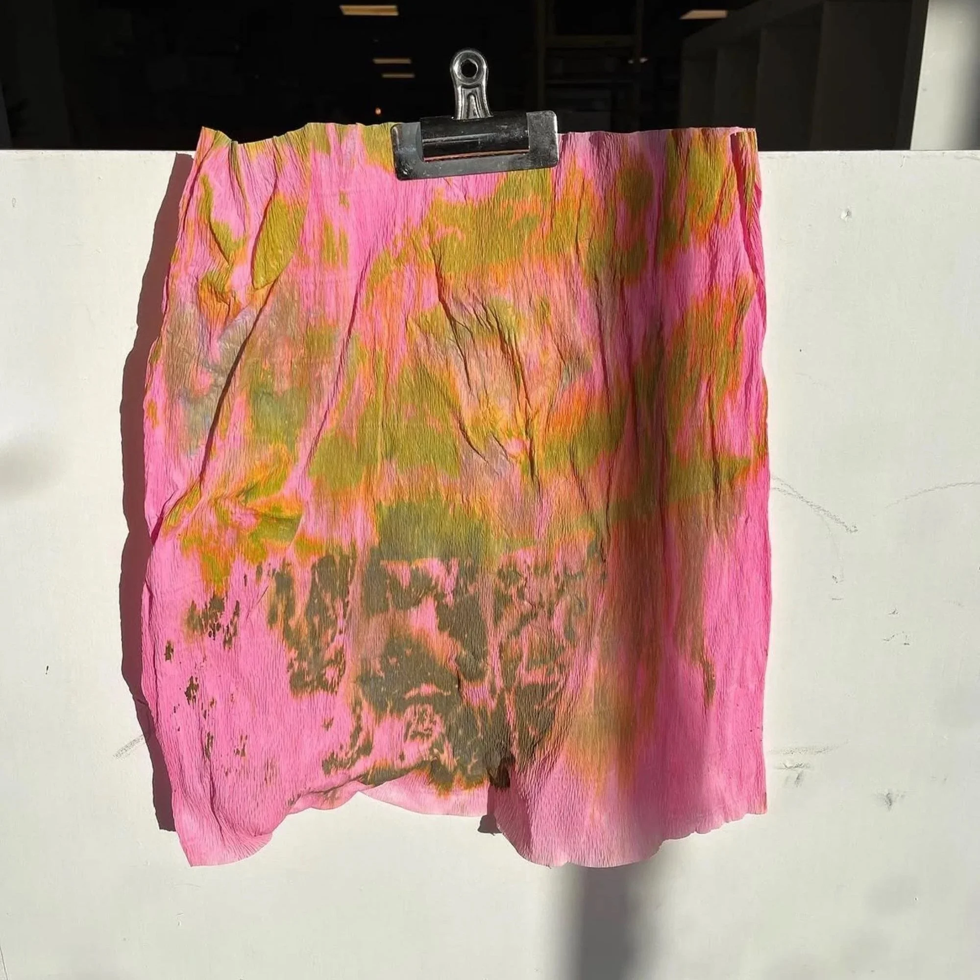
Colour is at the heart of my practice. One of the most joyful and liberating stages is hand-dyeing the paper itself — the moment raw sheets of fine Italian crepe paper are transformed into something alive with possibility.
I work exclusively with premium Italian crepe paper from Cartotecnica Rossi, a leading Italian manufacturer celebrated for its outstanding quality. The paper’s beautiful base colours, rich pigment payoff, and perfect stretch make it ideal for creating sculptural flowers with depth and vibrancy.
Unlike conventional painting, dyeing crepe paper is a true collaboration between artist and material. There is intention, but also surrender. The paper, pigments, water, humidity, and sometimes the weather all play their part. This unpredictability is what keeps the process exciting and alive.
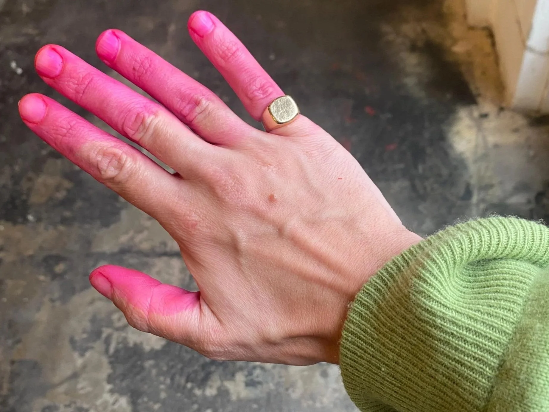
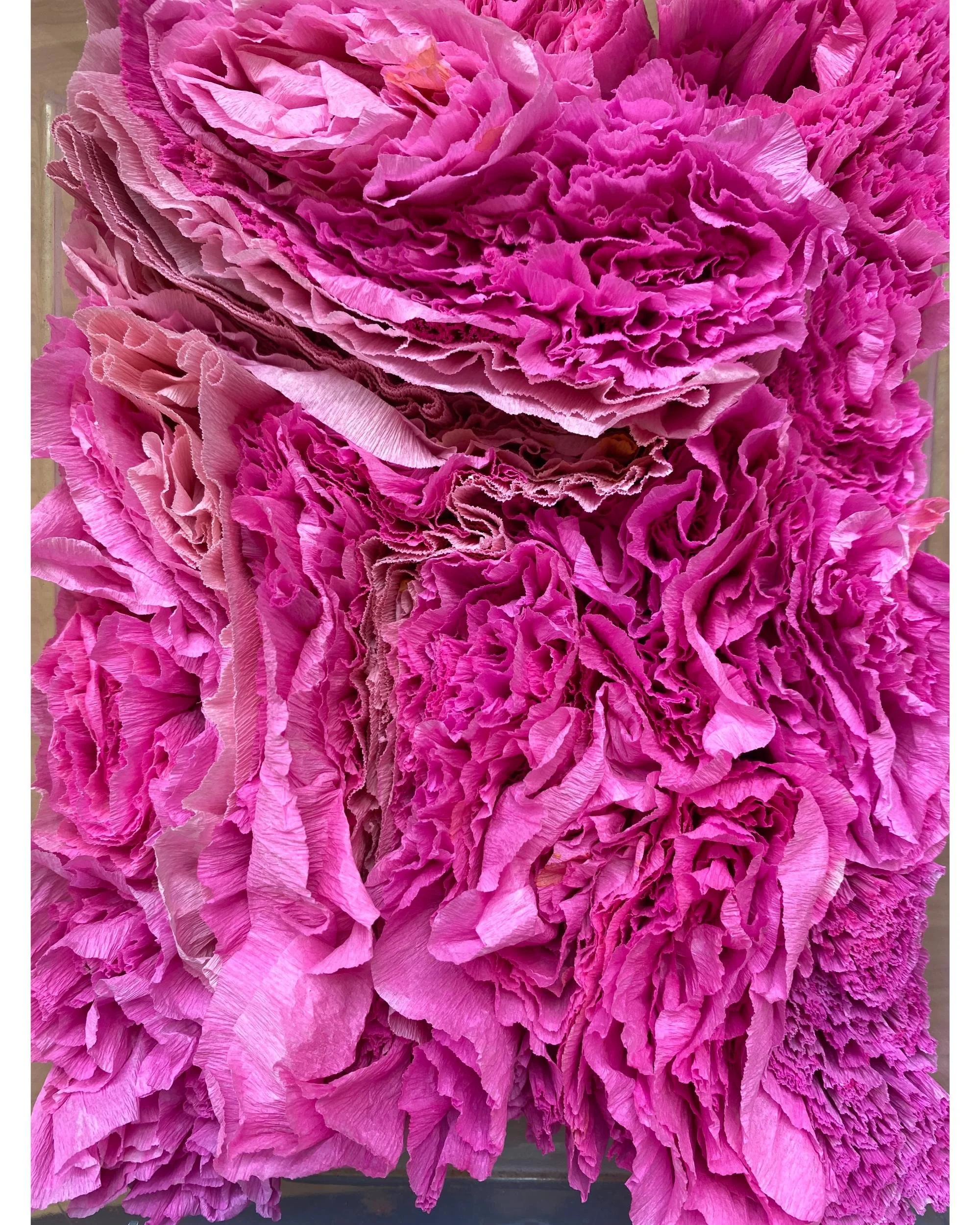
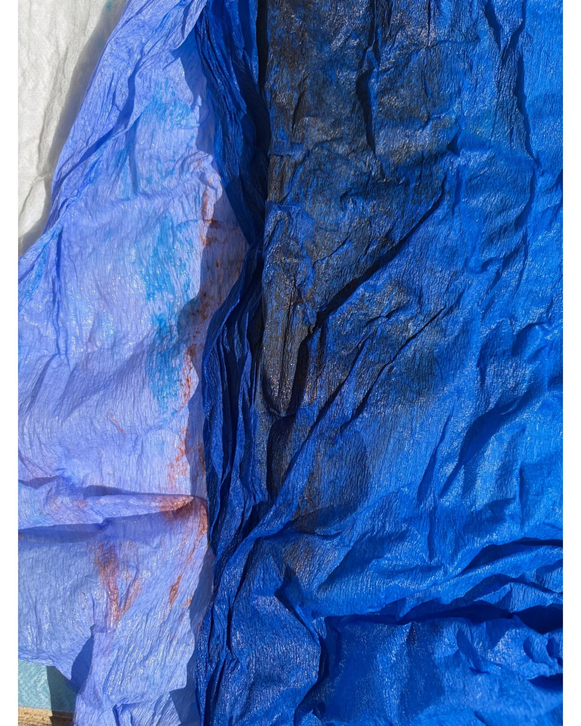
Proof of a dying session in Hackney, London, 2022.
The Dance Between Intention and Accident
Some dyeing sessions begin with a clear vision — carefully mixing pigments to capture the exact velvety burgundy of an anemone or the subtle veining of a fritillaria. Other days I work with complete openness, allowing colours to collide and reveal unexpected harmonies.
I frequently use leftover scraps from previous projects, turning the process into something cyclical and resourceful. Soaking the paper first helps the colour penetrate deeply, while the residue left in the water can offer beautiful clues for future palettes.
Materials and Mediums
My palette combines natural and artistic mediums: beetroot, onion peel, turmeric, red cabbage, coffee and tea for earthy tones, alongside liquid watercolours, inks, watered-down acrylics, and bleach for reverse-dyeing and delicate patterning.
Dyeing is one of the most time-intensive parts of any project. It involves considerable trial and error, layered applications, and patient waiting for each layer to dry. I always try to dye the paper several days before production begins. This allows me to observe how the colours develop over time, sleep on the results, and return with fresh eyes to make subtle variations and adjustments.
I also remain mindful that colours can shift slightly when glue is applied during assembly — something I carefully account for in the final stages.
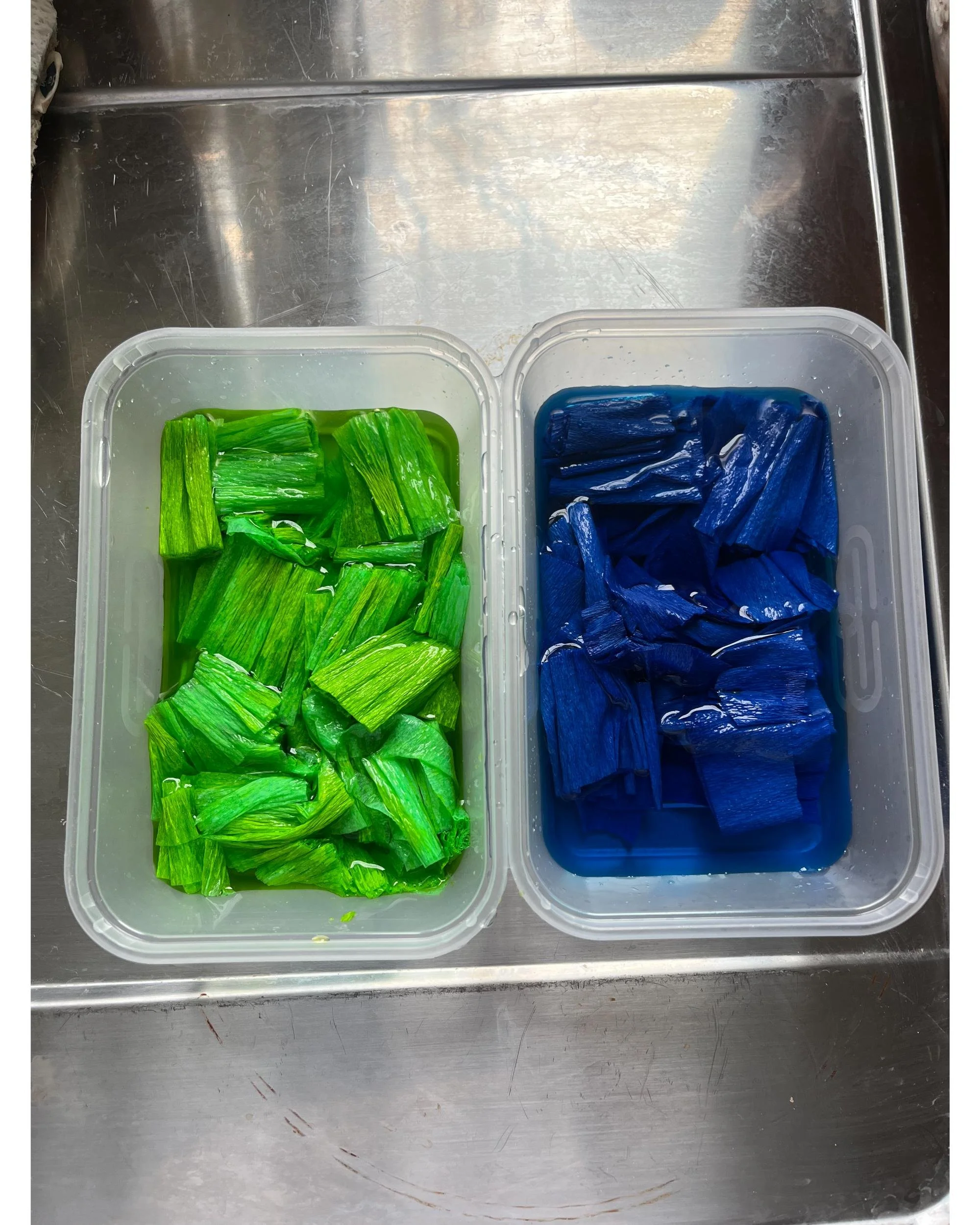
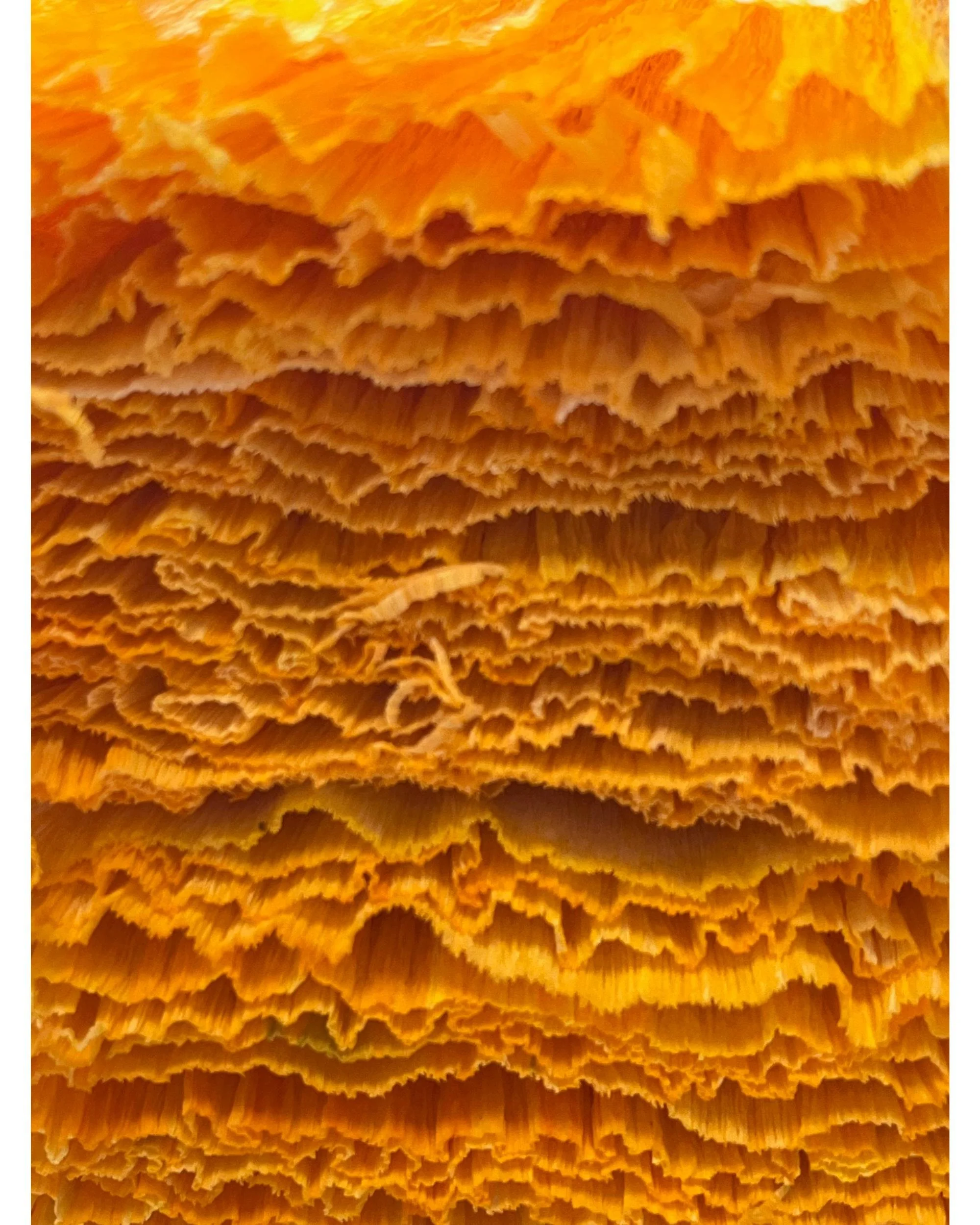
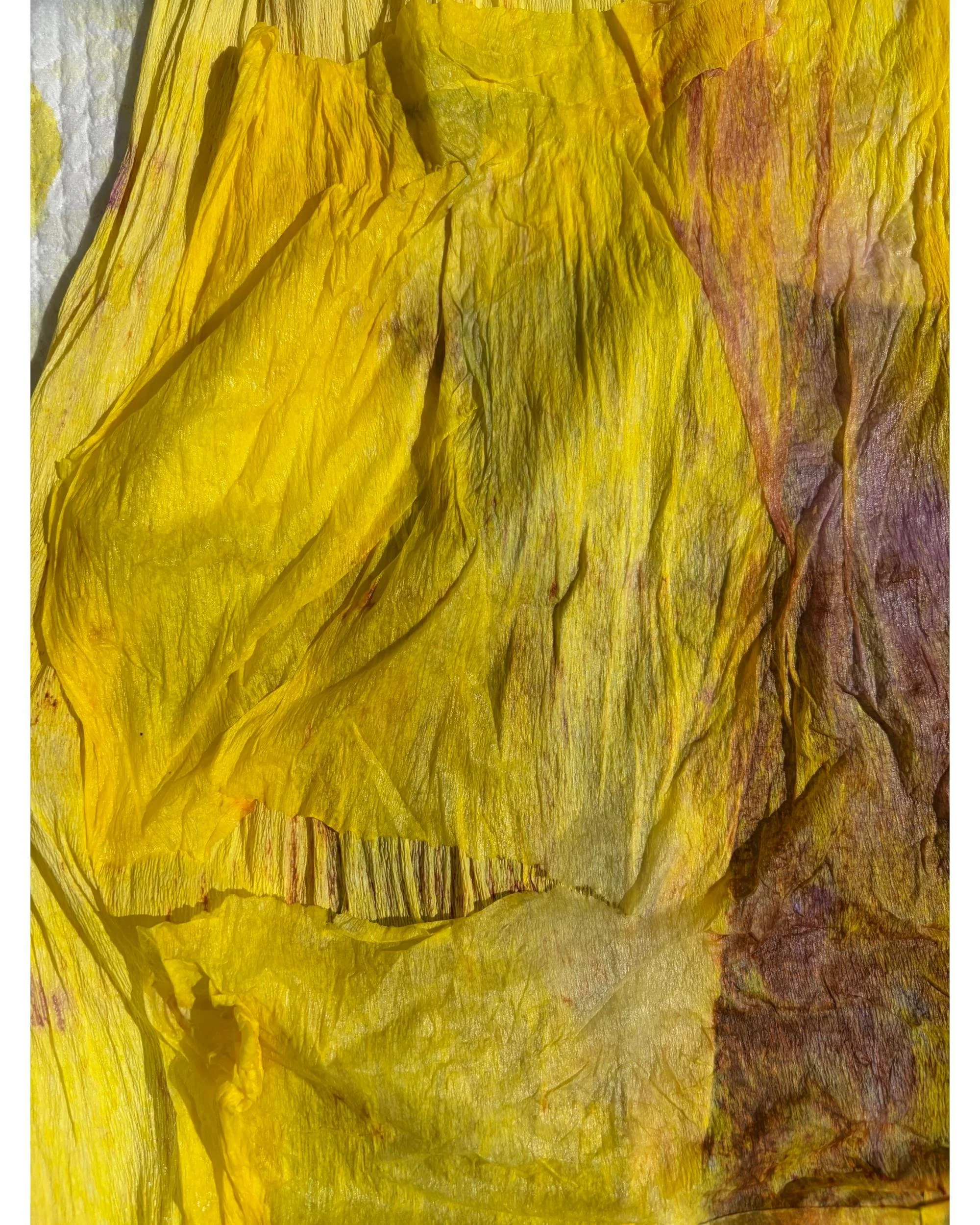
Bleach-painted paper for Snake’s Head Fritillaria flowers, London, 2023.
Artistic Influences
I draw significant inspiration from Impressionist and Post-Impressionist paintings when developing colours and mood. The way these artists captured light, atmosphere, and emotional resonance deeply influences my work. Even Vincent van Gogh’s Irises serves as a fascinating reference — originally painted with more violet tones, the painting has naturally shifted over time to its now iconic blue hues due to pigment changes. It’s a beautiful reminder that colour is never entirely static, even in great masterpieces.
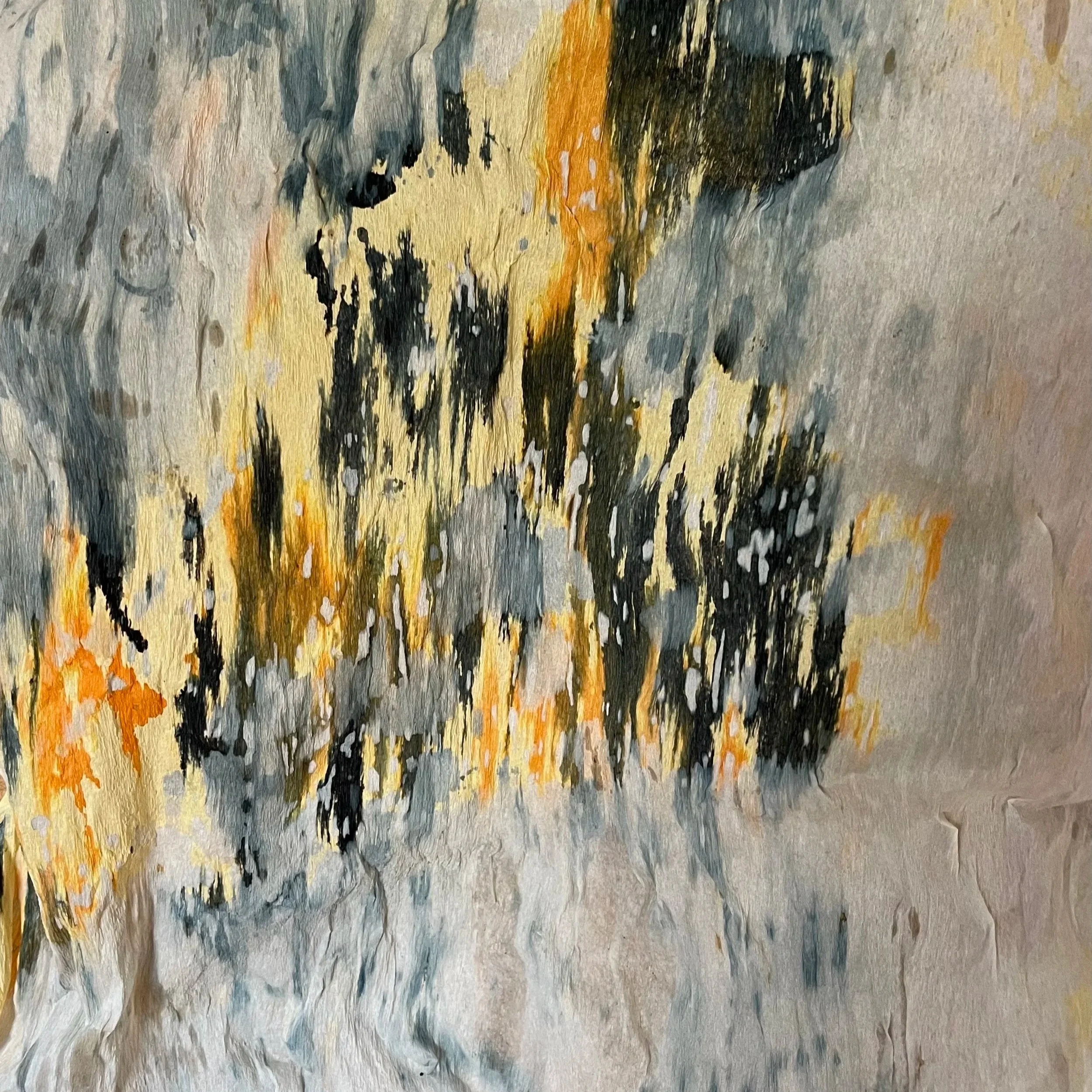
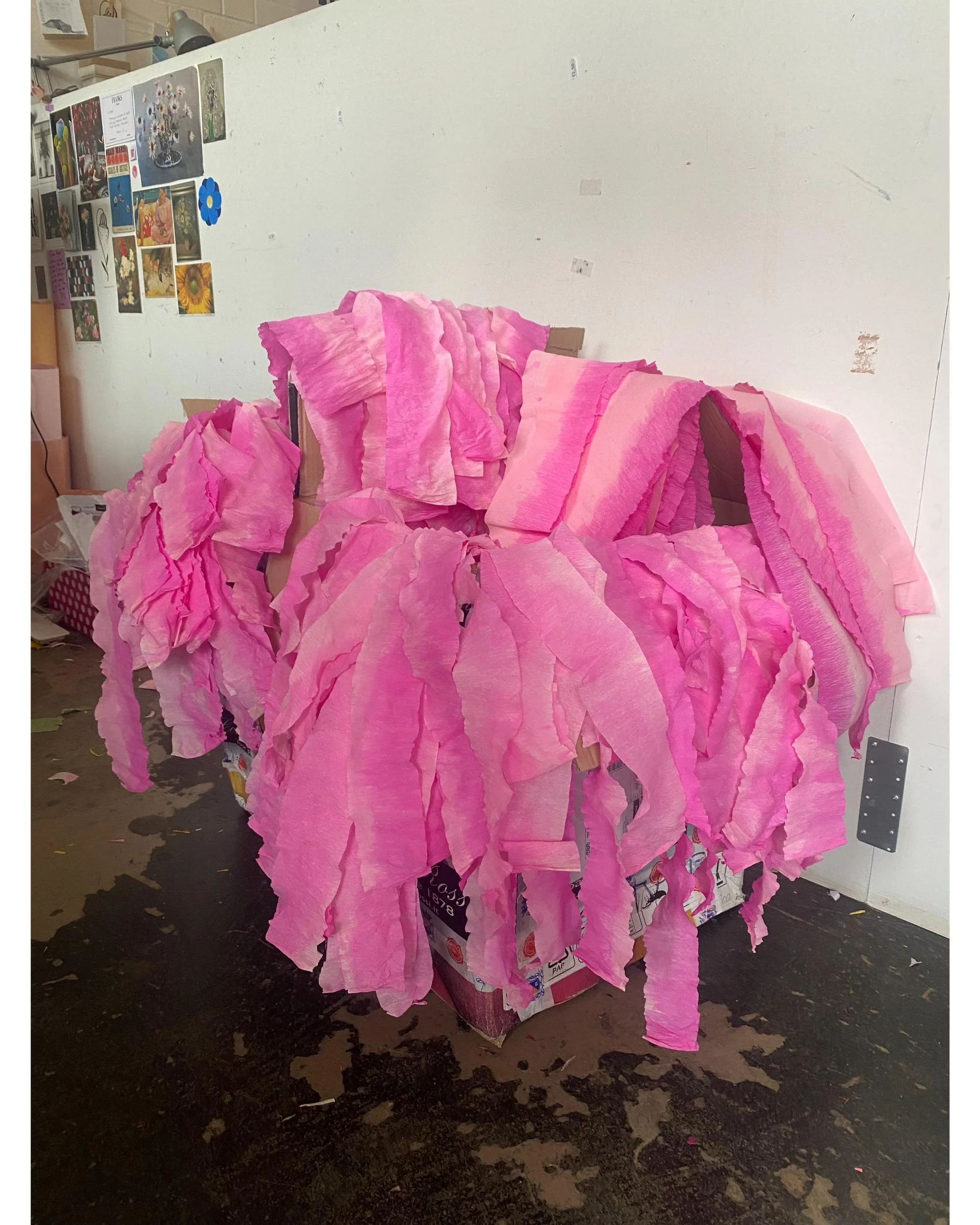
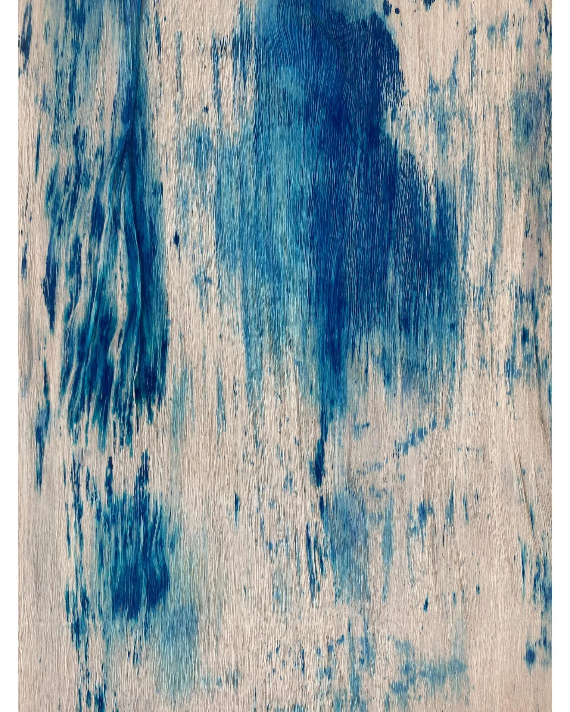
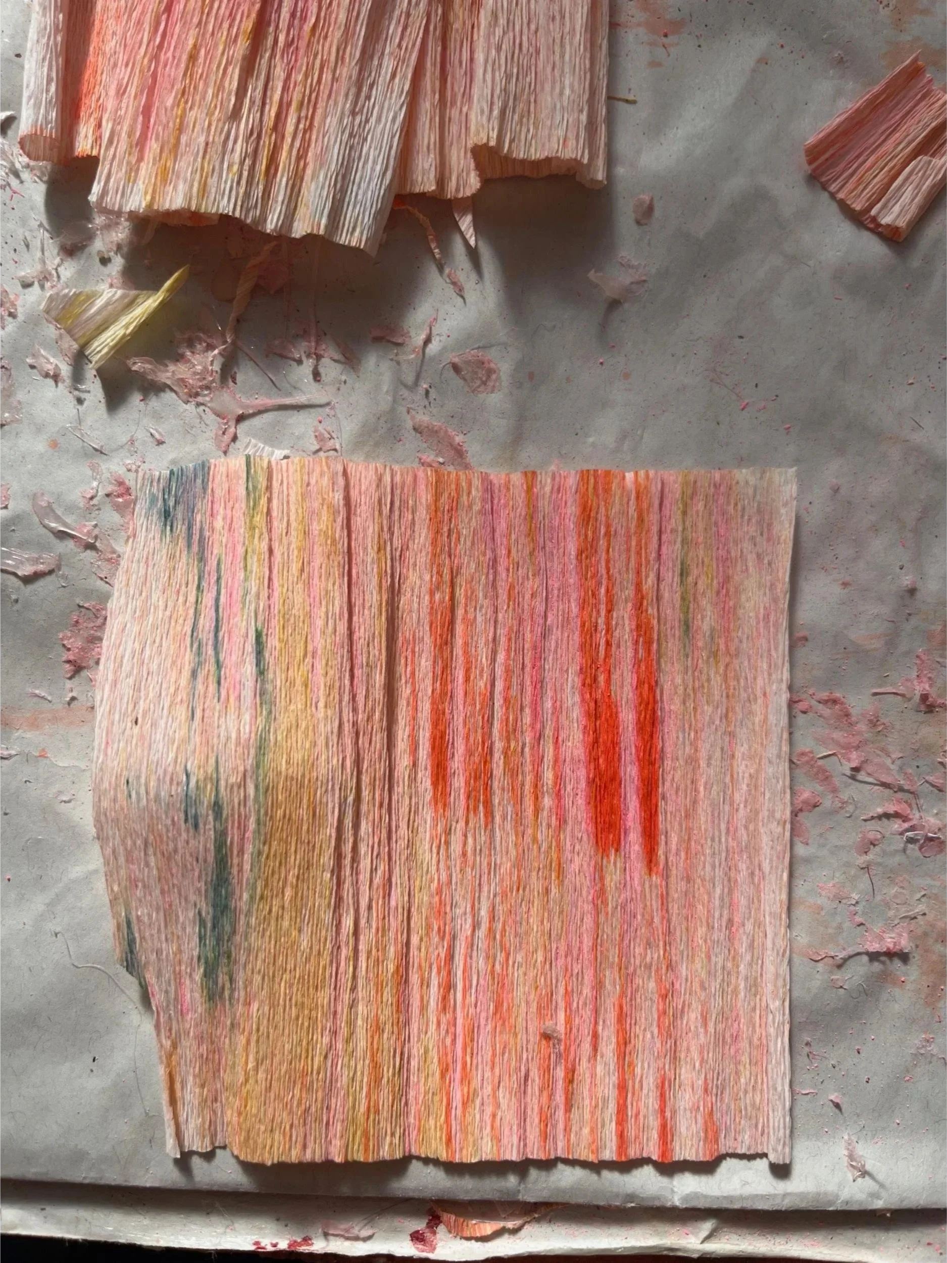
One of my favourite happy accidents. This sheet was left outside with dye on it and got caught in the rain, North London, 2025.
From Dyed Paper to Sculptural Flower
These hand-dyed sheets become the foundation for every sculptural flower. The colours and textures achieved during this early stage directly shape the emotional character of each finished piece — from the quiet melancholy of a Snake’s Head Fritillaria to the bold energy of a Parrot Tulip.
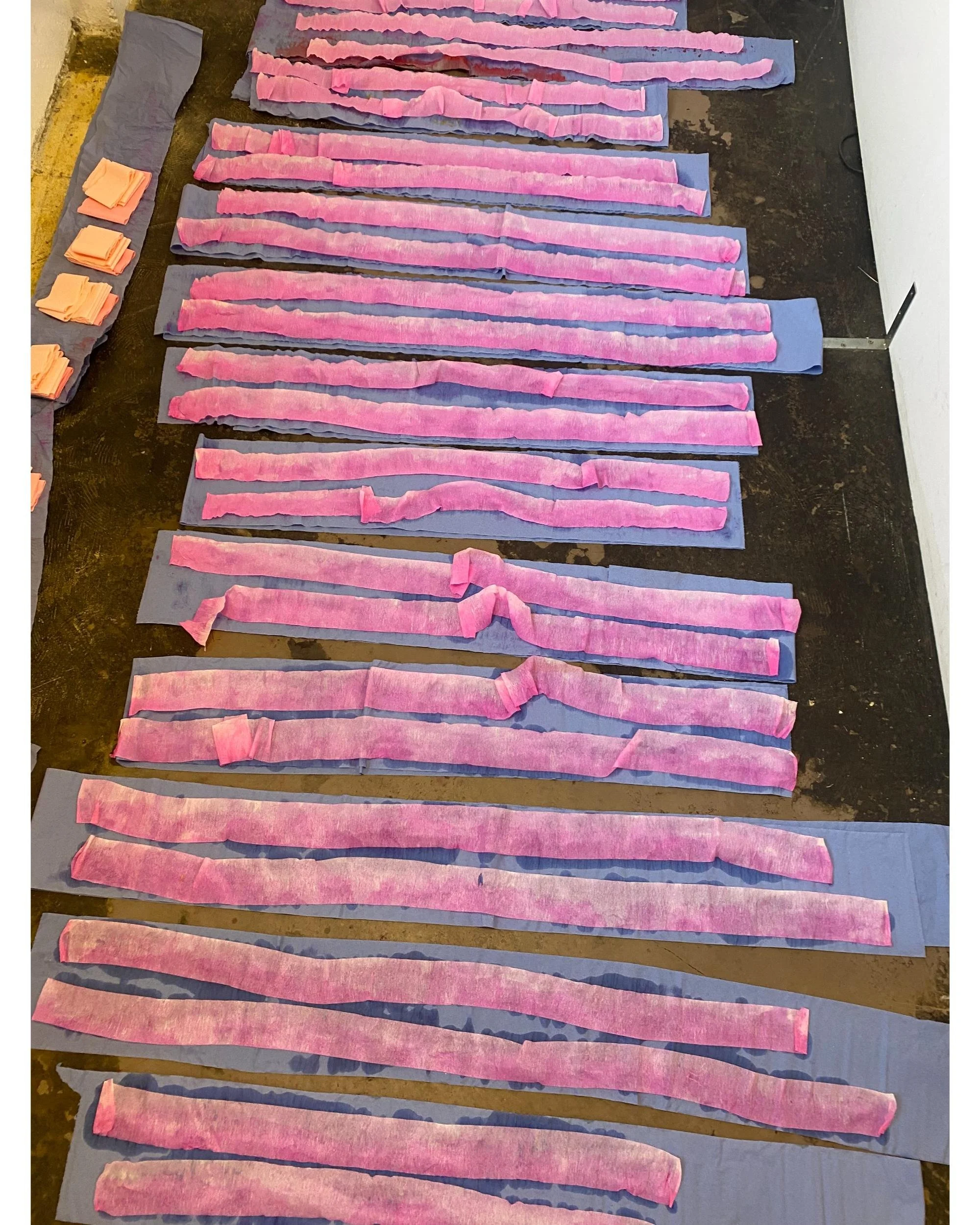
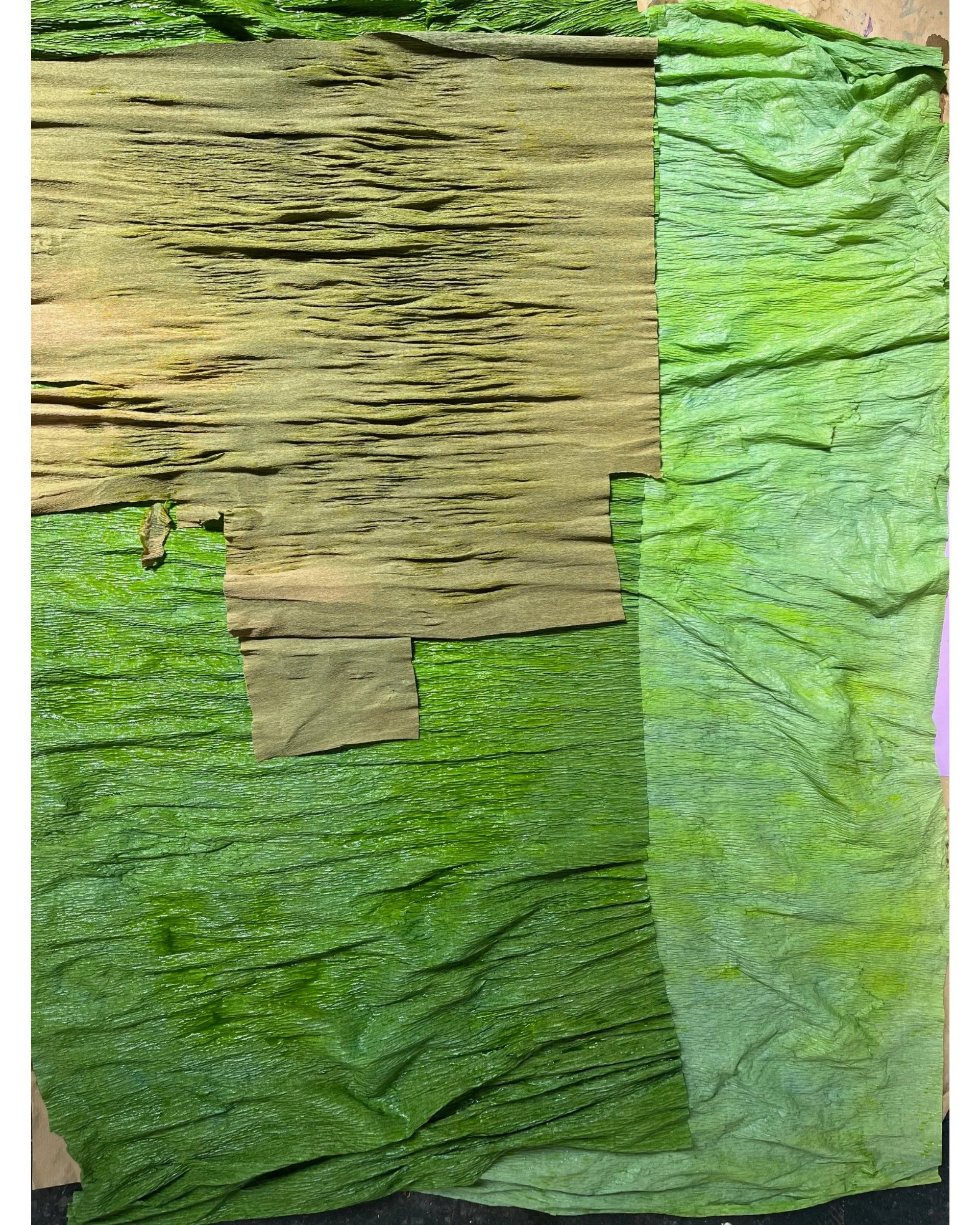
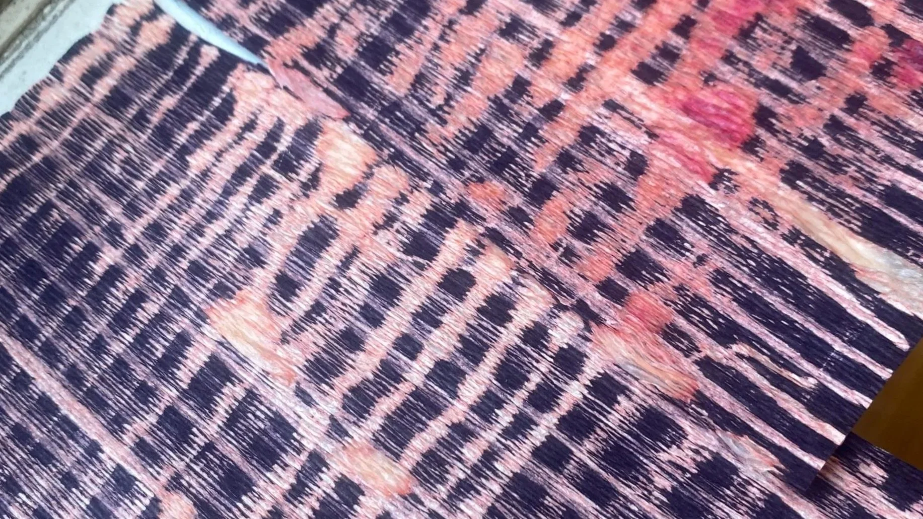
Vibrant hand-dyed paper achieved by layering a pink sheet on top of wet green paper, Hackney, London, 2023.
Caring for Your Paper Flowers
Because the colours are achieved through delicate pigments, I recommend keeping the flowers out of direct sunlight, as prolonged exposure can cause gradual fading. With proper care, these pieces will retain their vibrancy for many years.
Ink and watercolour paper for Irises. Created for the Completed Works x Matches collaboration. I layered ink and watercolours to achieve these soft, streaky, almost iridescent tones, London, 2021.
A Final Reflection
For me, hand-dyeing paper is far more than a technical step. It is a daily practice in presence, curiosity, and acceptance of what emerges. Some of the most beautiful outcomes arise precisely when control is balanced with openness — when I allow the material, the moment, and sometimes even nature to have their say.
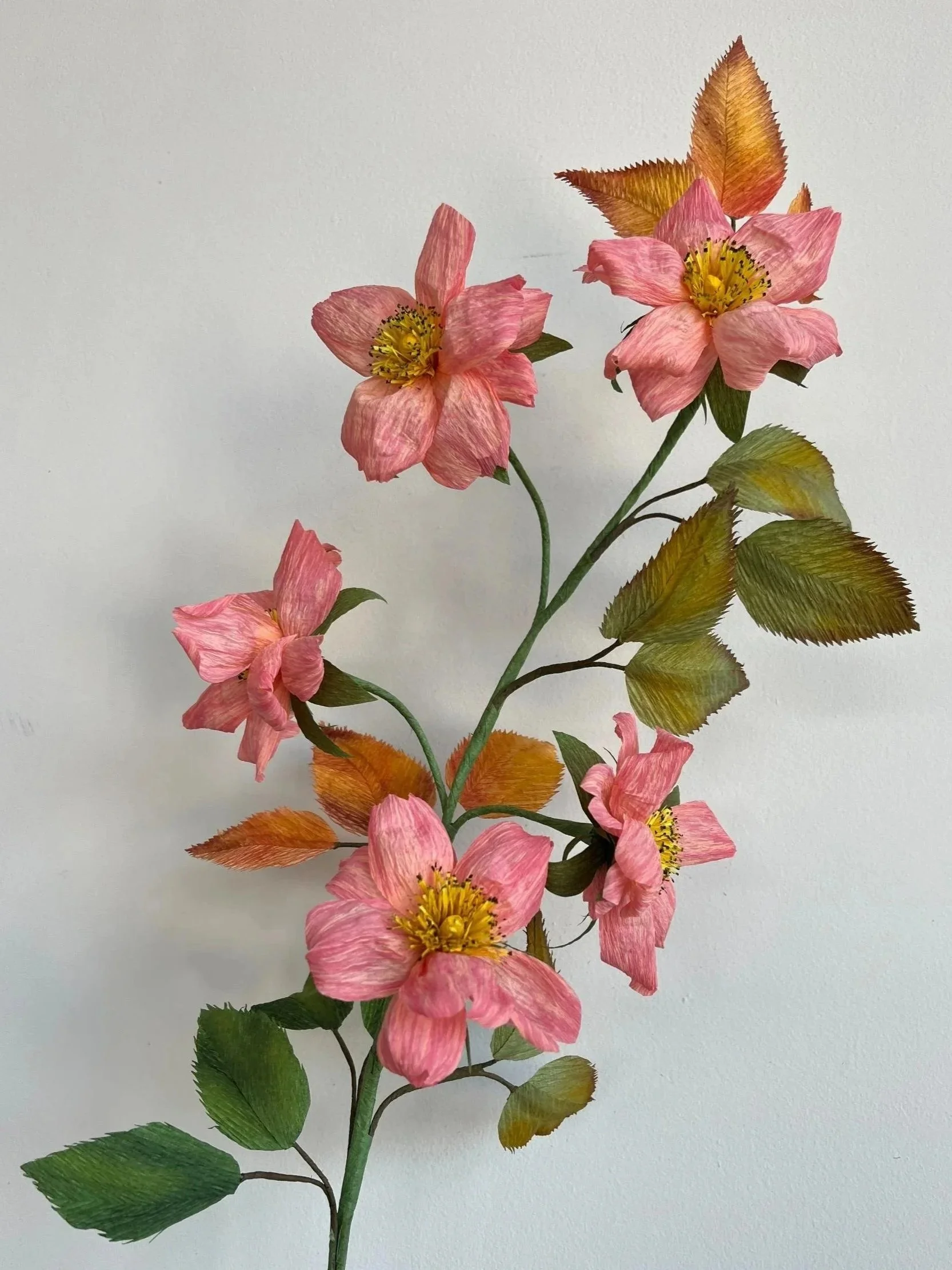
Wild roses are different from garden roses — smaller blooms, more of them, and they grow in all directions at once. That's what I was going for with this branch. Five flowers at different stages, some fully open, some still partly closed, all on a single branching stem with leaves that shift from deep green through to gold and bronze.
Each leaf is hand-painted individually. No two are quite the same shade, which is what gives the whole thing that slightly autumnal, just-cut-from-a-hedgerow feel.
The stem is wired so you can bend and adjust it once it arrives — lean it against a wall, put it in a wide vase, let it do its own thing.
This one won't be repeated.
One branch with multiple blooms | Height: approx. 50–55cm
Hand-painted Italian crepe paper, wired stems
One of a kind