
Poppies, Then and Now
An archive retrospective
Poppies are usually one of the first flowers a paper artist learns to make. Every one of us has our own version. That doesn't mean it's a simple flower — if anything, the opposite. So much of its impact comes from the design itself: that iconic centre, the fringed stamen, the way the petals catch light. Everyone develops their own way of building it, and mine has changed more times than I can count. Different centres, different petal shapes, different ways of getting colour into the paper.
I thought it was time to go back through the archive of my North London studio and look at some of my favourite poppies over the years — what I was doing, what I've learned, what's stuck and what hasn't.
Where it started
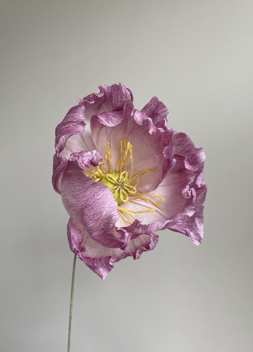
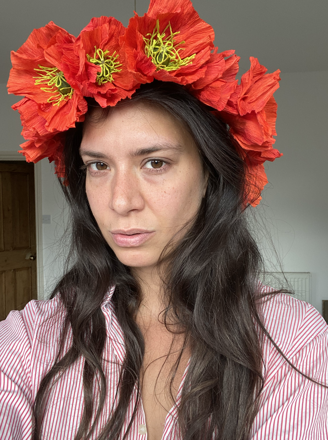
My first poppies were large and bold, and this is honestly where I fell in love with colour. So many combinations to try, and the way the petals move catches your eye before anything else does.
The centres on these early ones were big, built up with layers of crepe paper. For the stigma, I rolled crepe paper into really thin strips, split them into five, and curled each one into a little bow shape. I thought it looked so cute. It was fiddly, my fingers ached by the end of it, but looking back I like the folk feel it gave the flower. Less about realism, more about impression. Not really a choice at the time, more just where my skills were.
The stamens were rolled crepe paper too. I remember making forty poppies for one order and the rolling alone left my fingertips sore for days. For the two-toned petals, I used pan pastels to build the gradient, a technique I still lean on now, even if how I use it has changed a lot since.
Moving away from the bow
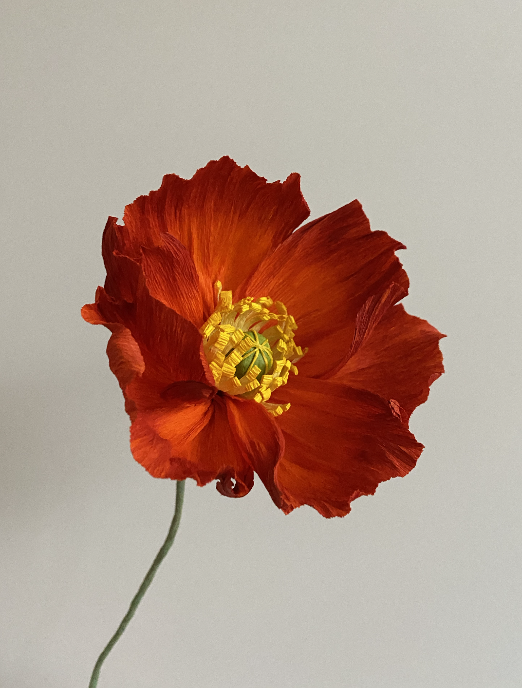
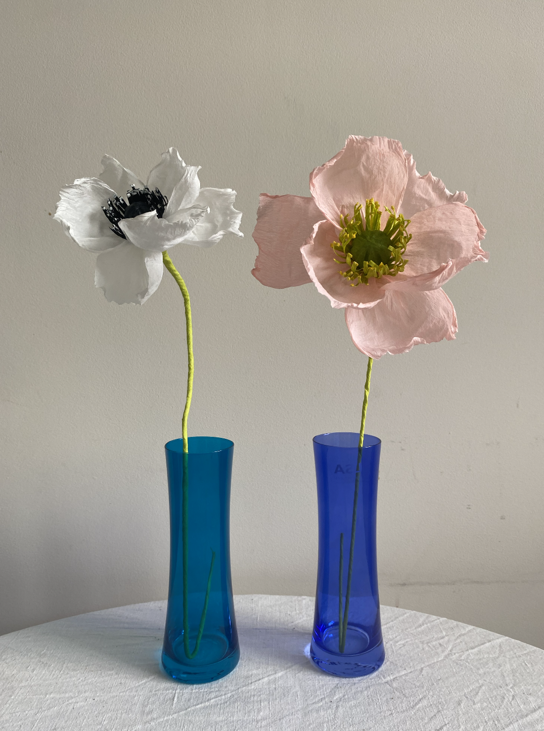
The bow centres didn't last. I moved on to wrapping a strip of rolled paper around the stigma instead, and rather than rolling each stamen by hand, I started layering paper using a laminating technique, then practising cutting the stigma as fine as I could get it.
Looking back, I think these ones look a bit clumsy. But there's a charm to them, and I still like how they sit in an interior — something about the slight roughness works when they're not under close scrutiny.
Learning to dye
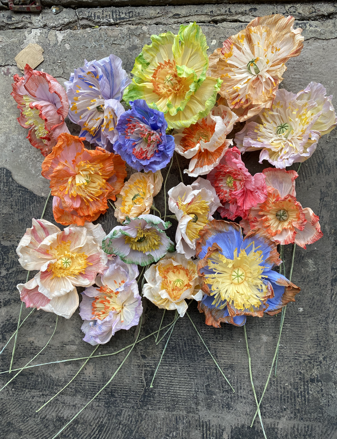
Poppies for Maggie Owen, 2021.
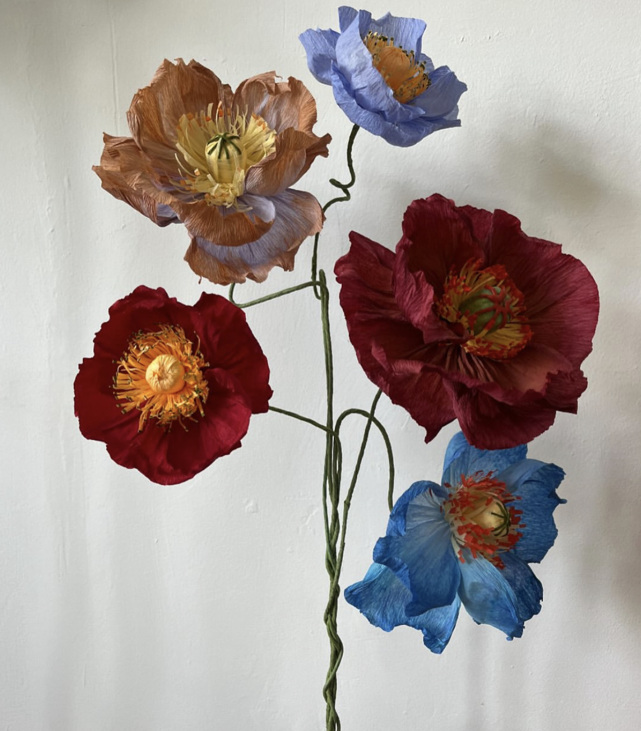
In the summer of 2021, Maggie Owen commissioned me to make colourful poppies for her shop. She gave me a lot of freedom, which meant I could experiment properly for the first time. That commission is where I really started to understand dyeing paper.
I'd soak paper to pull out the pigment, then dip petals into contrasting colours. Blue dipped into orange gave this rustic brown at the tip of the petal that I hadn't planned for and couldn't have predicted. I painted stripes onto some. Every experiment seemed to work in its own strange way, and together they opened up a whole new side of the work for me.
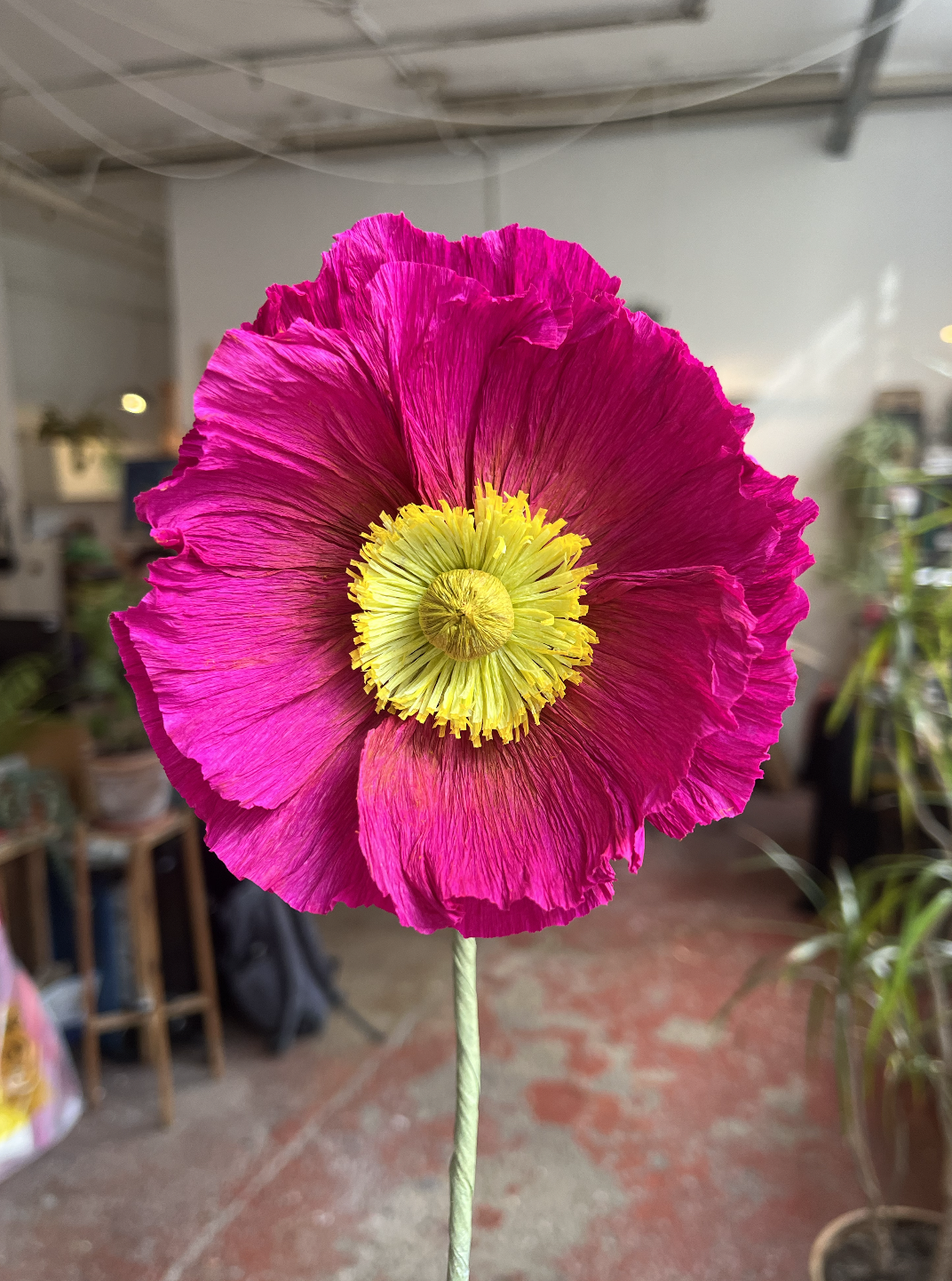
Treating the flower as a canvas
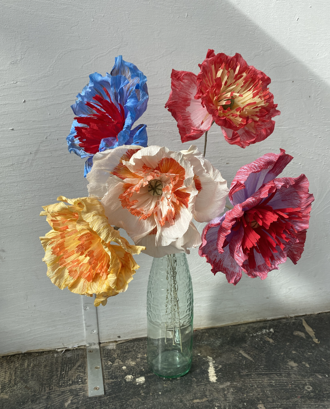
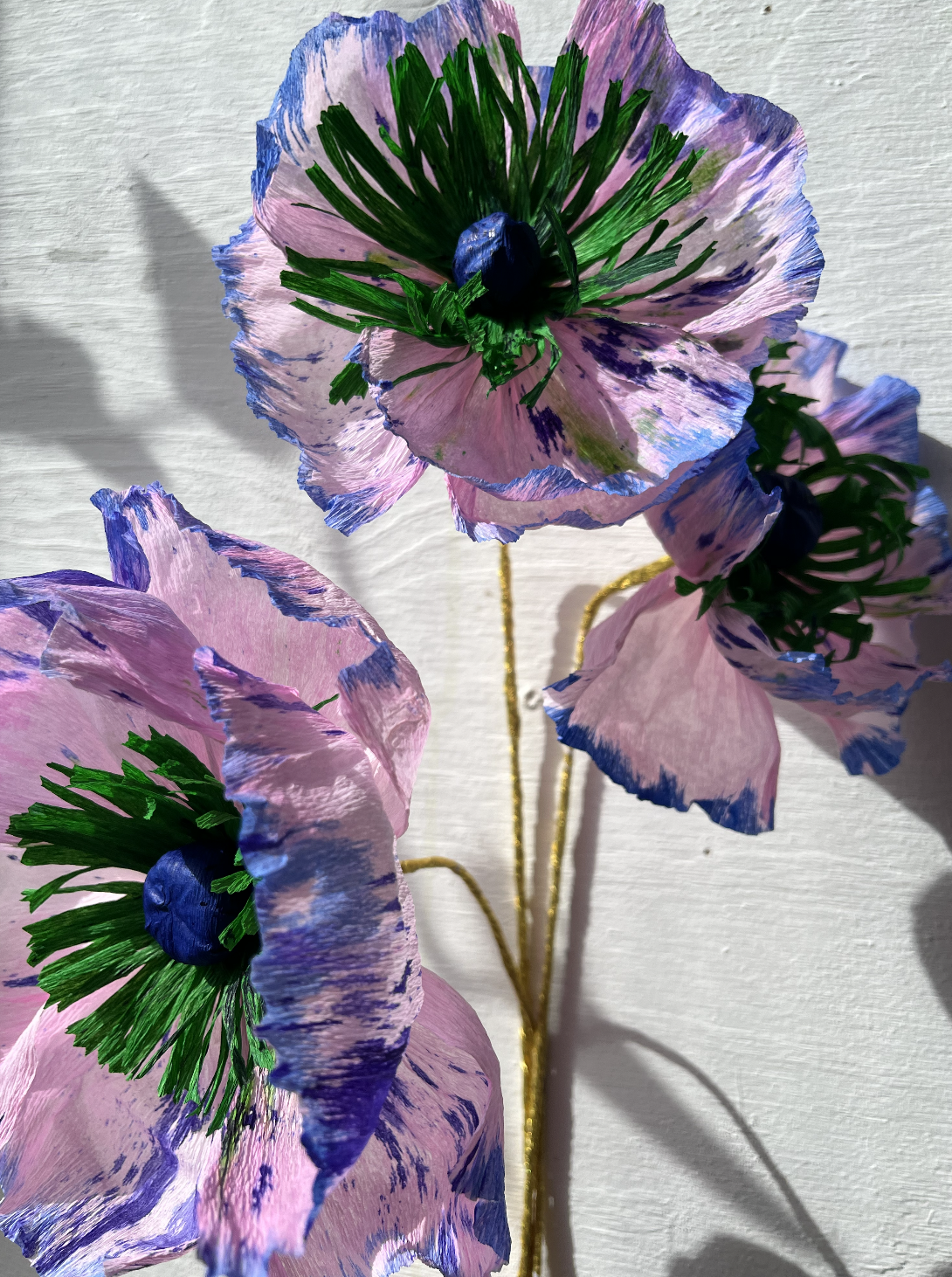
At some point the material stopped being about the subject and became more like a canvas. Paper can't compete with a real flower, not really, and once I stopped trying to make it, something opened up. I wasn't chasing realism anymore. I was using the poppy shape to say something else entirely.
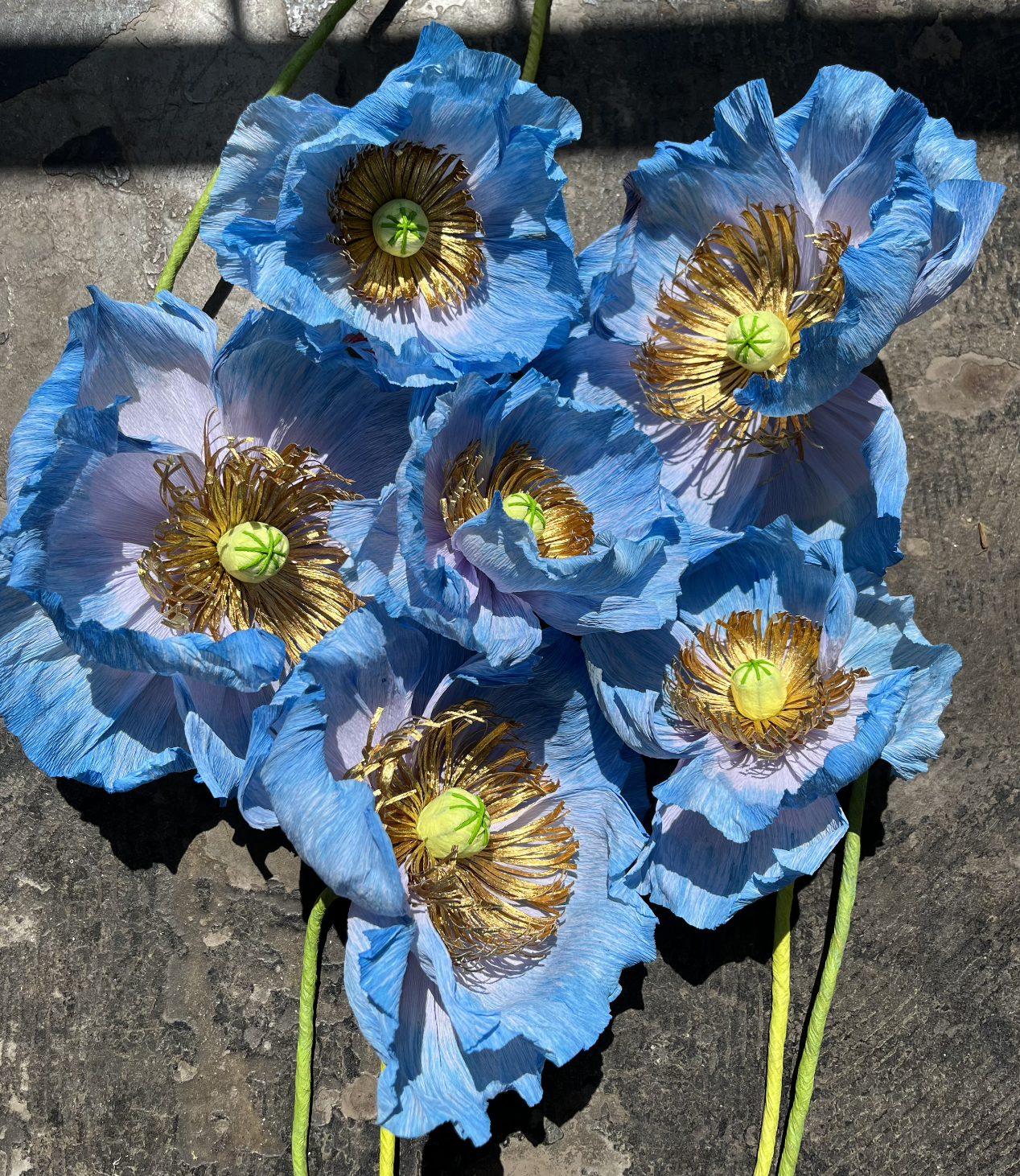
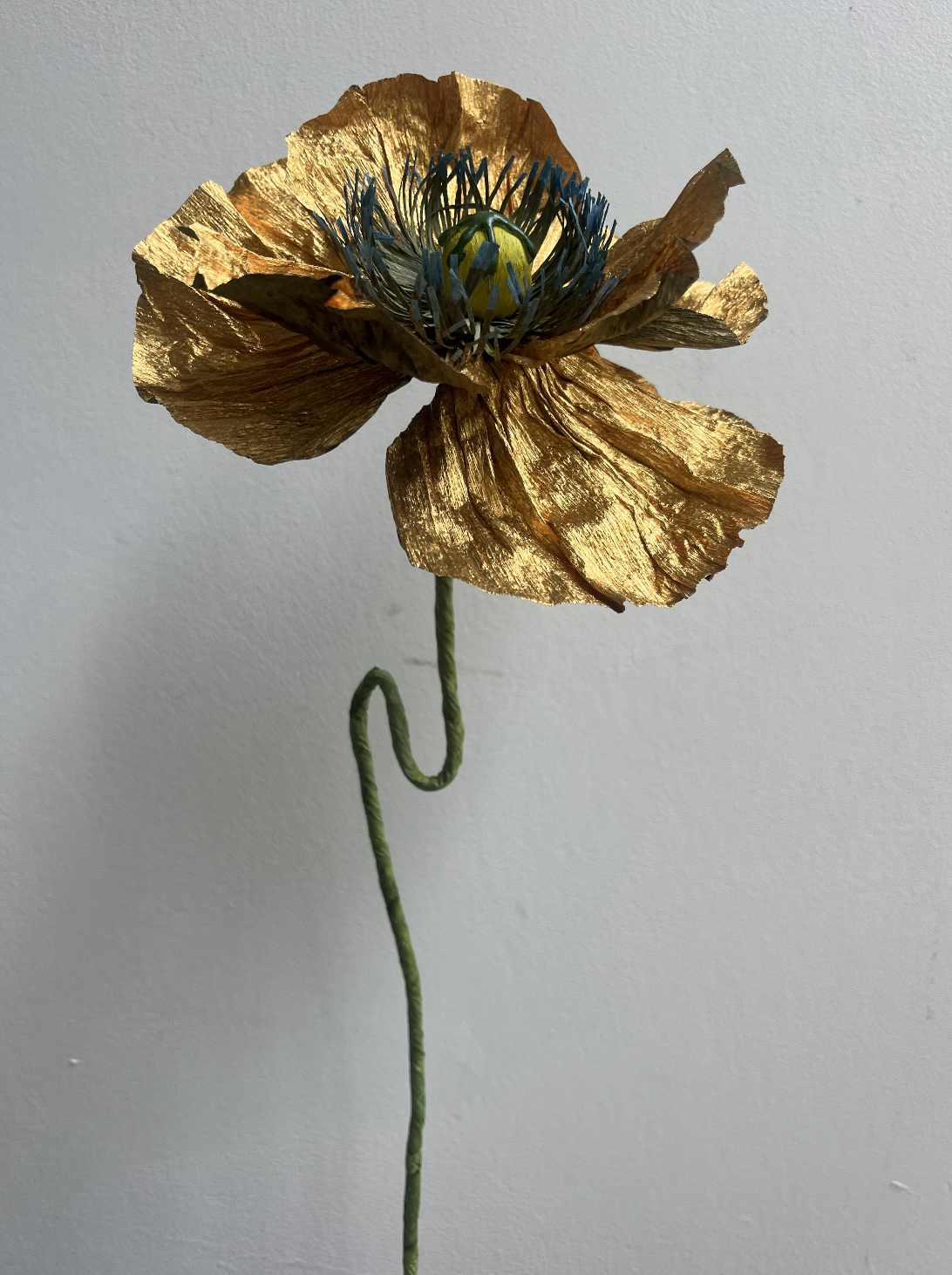
Nature was still there in the background, pushing me to get the forms right, the curl of a petal, the way it should sit on the stem. But the real expression, the part that was actually mine, came through in colour. Gold against black. Silver worked into a burnt orange. Things a real poppy would never do.
That same freedom, not being tied to what a poppy is supposed to look like, is what let me start building poppies around someone else's space instead of just my own instincts. Around this time I also started getting more commissions from people who wanted flowers designed for their particular space, something no one else would have. That shift meant I had to actually understand poppies as flowers, not just as a shape I'd got used to making.
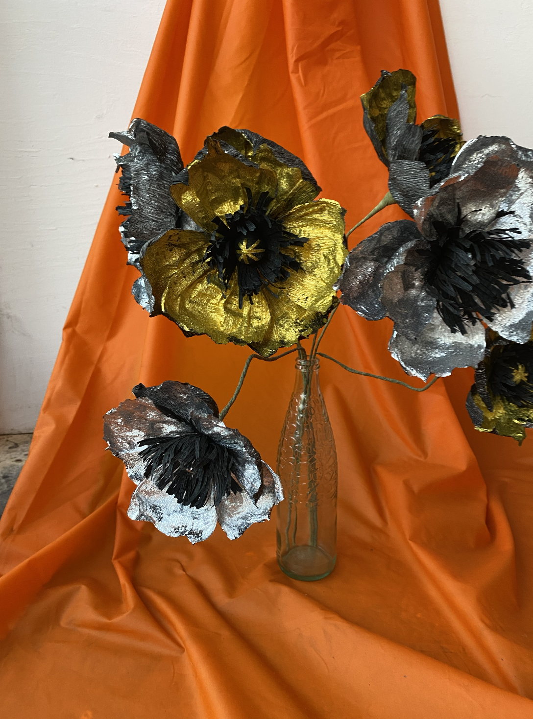
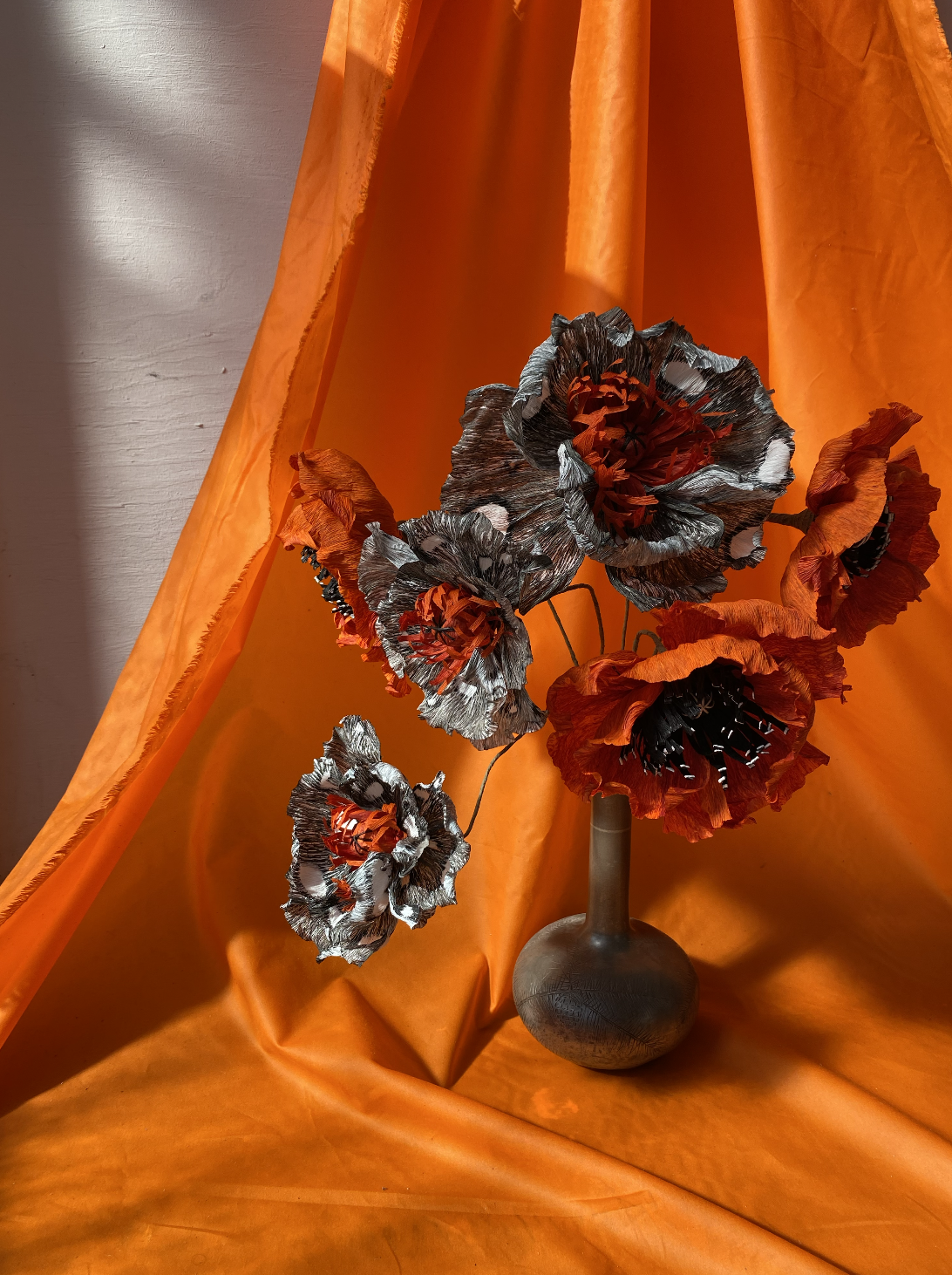
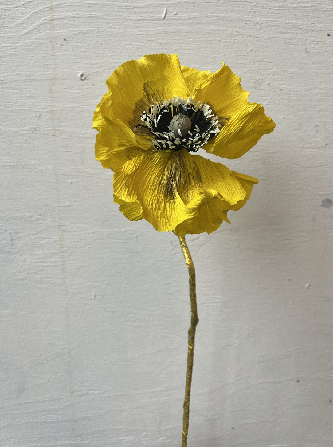
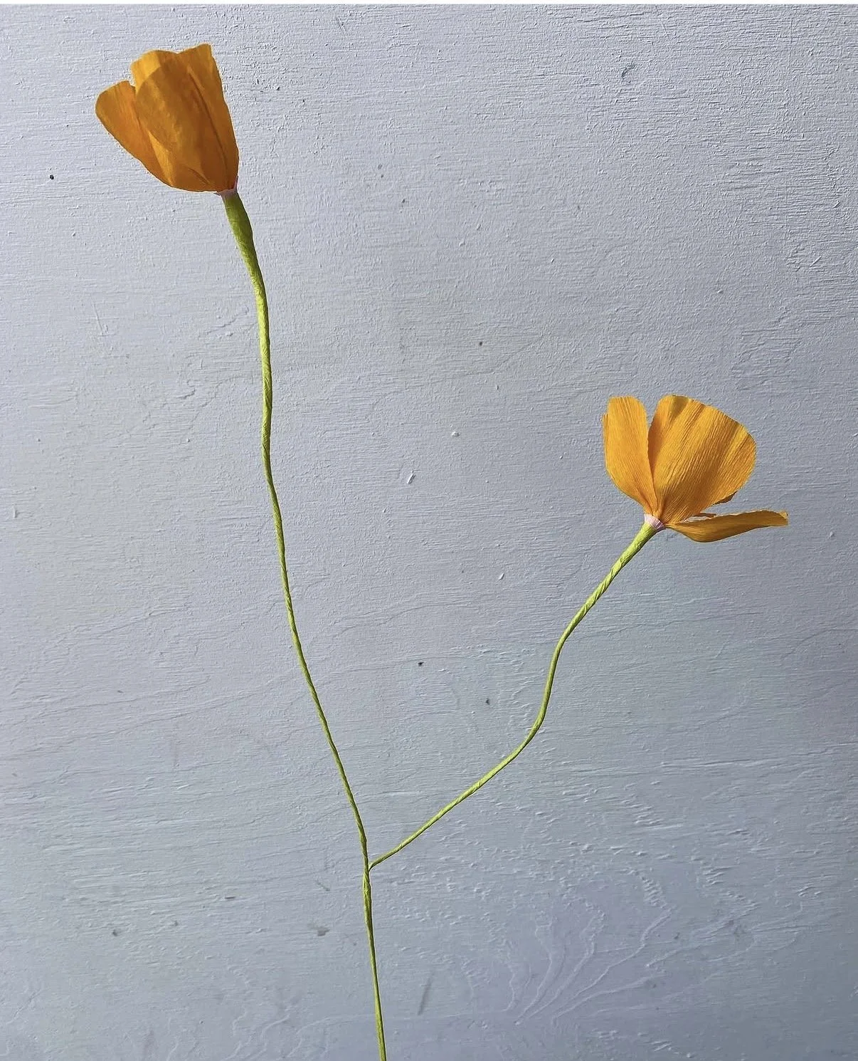
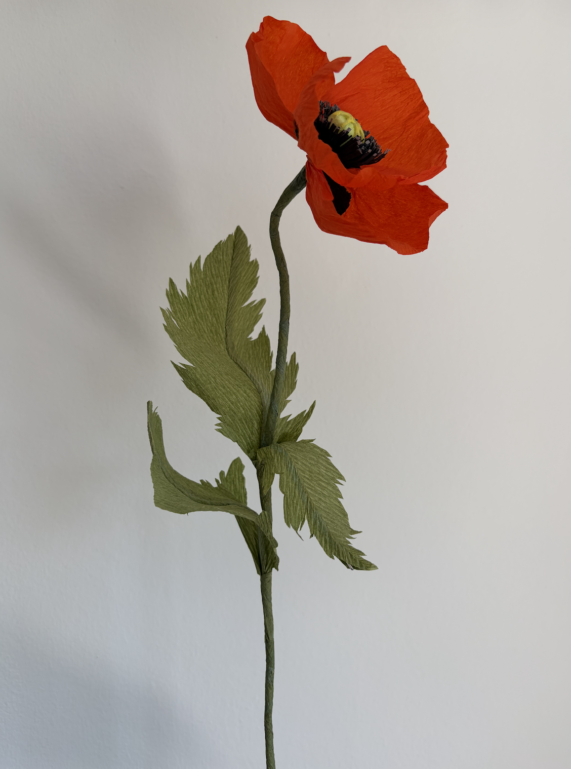
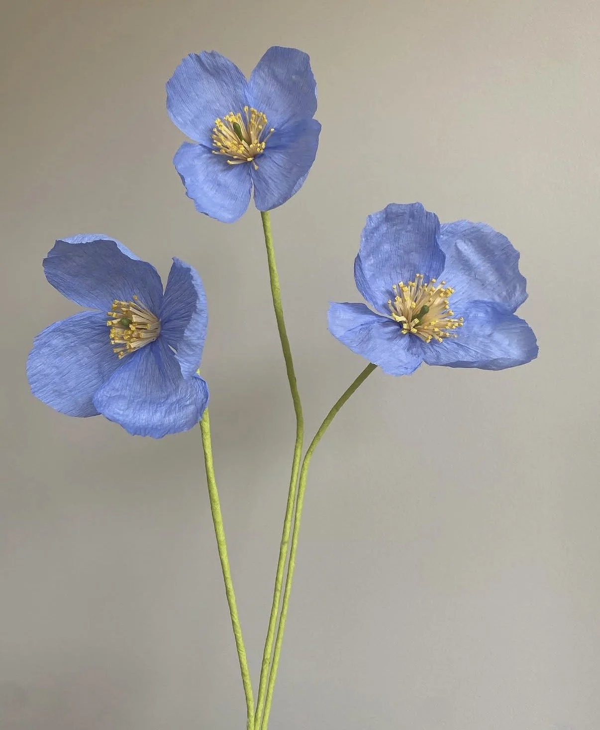
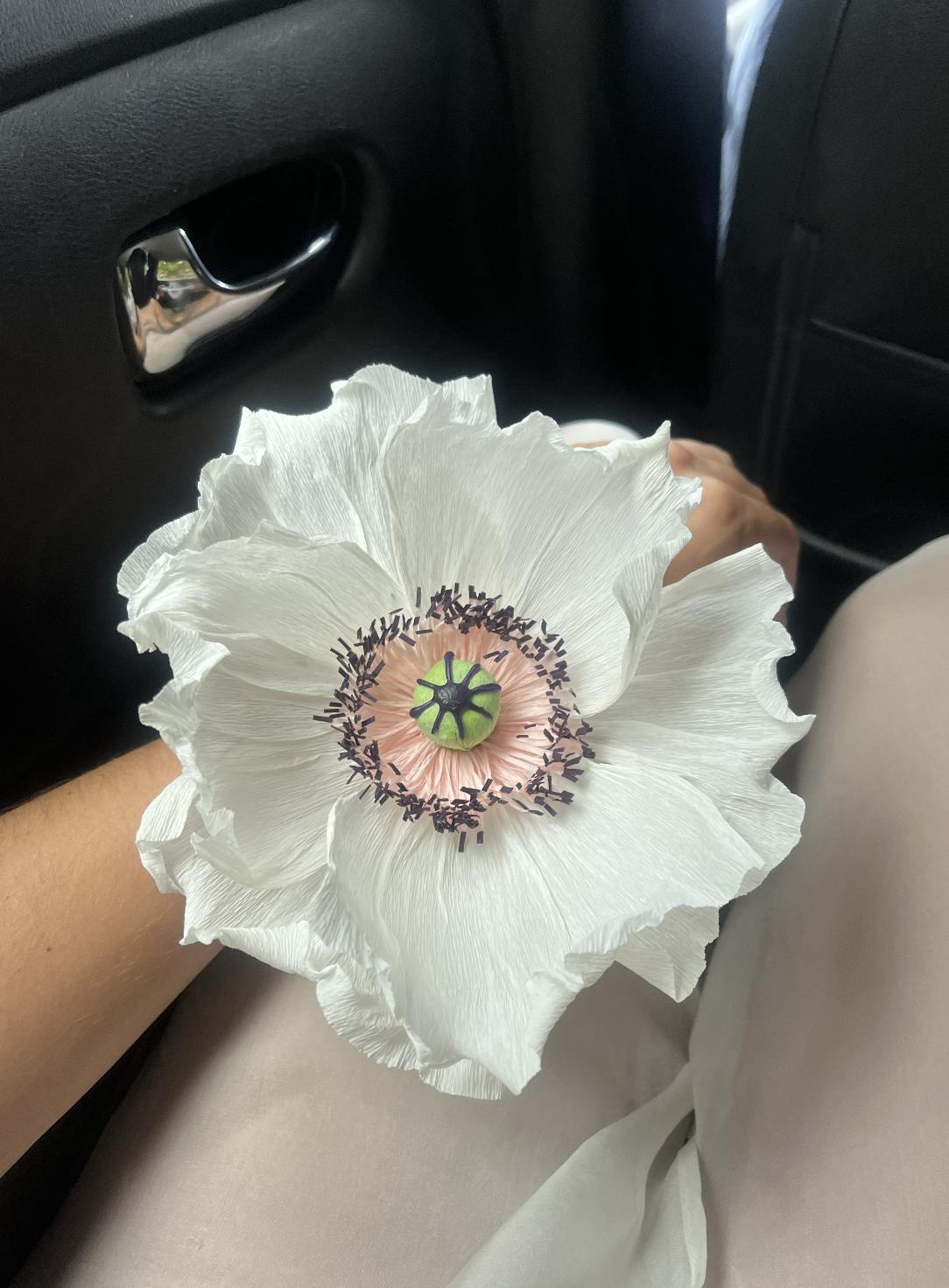
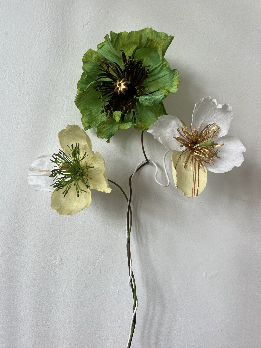
Icelandic poppies are thin and papery, pale, closest to what crepe already wants to do on its own. Opium poppies are bigger and ruffled, near-black centres, grey-green foliage. Himalayan poppies are that impossible true blue, translucent, hard to grow and harder to fake. Californian poppies are small and cup-shaped, a clean, cheerful orange. Oriental poppies are the showy ones, oversized, with a dark blotch at the base of each petal.
Knowing the difference meant I could stop defaulting to one poppy for every brief. A quiet room gets something closer to an Icelandic. An entrance wants the scale of an Oriental.
Sculpting the stem
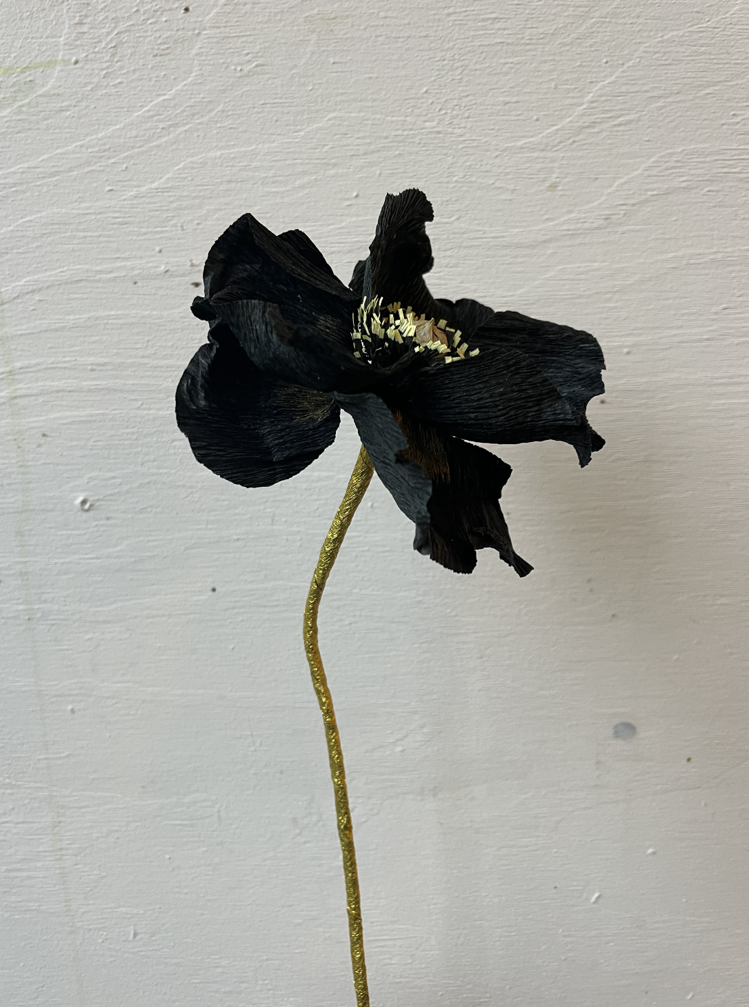
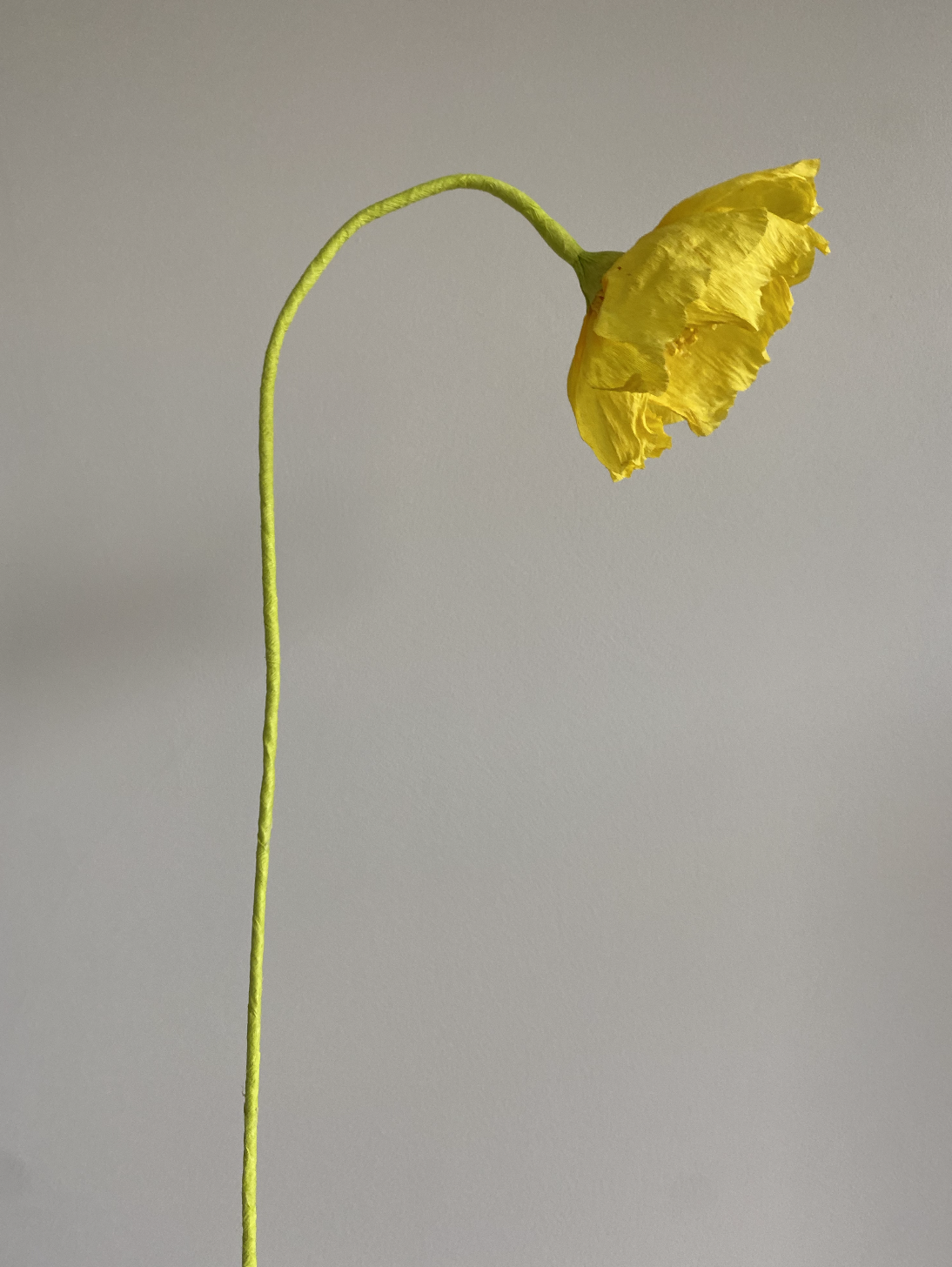
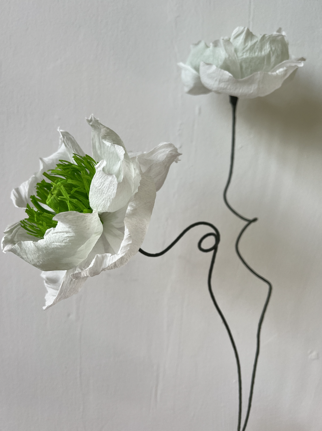
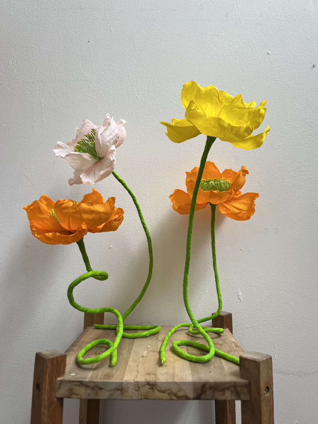
I wasn't always confident with this part. For a long time the flower head was where all my attention went, and the stem was just what held it up. But the stem is the difference between a paper flower and a sculpture. It's what takes the work from "well made" to something with real presence.
Sculpting an arrangement means knowing where to leave space and which angle actually flatters a flower, rather than just facing it forward and calling it done. I look to nature for this more than anything else. A flower reaches for light, so does it lean? Is it drooping, worn out, or standing up young and eager? Does it curve to follow the neck of a vase, or hold itself apart, independent of whatever it's sitting in? Sometimes there's no vase at all. It's freestanding, or mounted straight onto a wall, and then the stem has to do even more work on its own.
None of that comes from a manual. It's from looking, a lot, and getting comfortable enough with wire and paper to let the stem do something a real poppy never could.
Where I am now
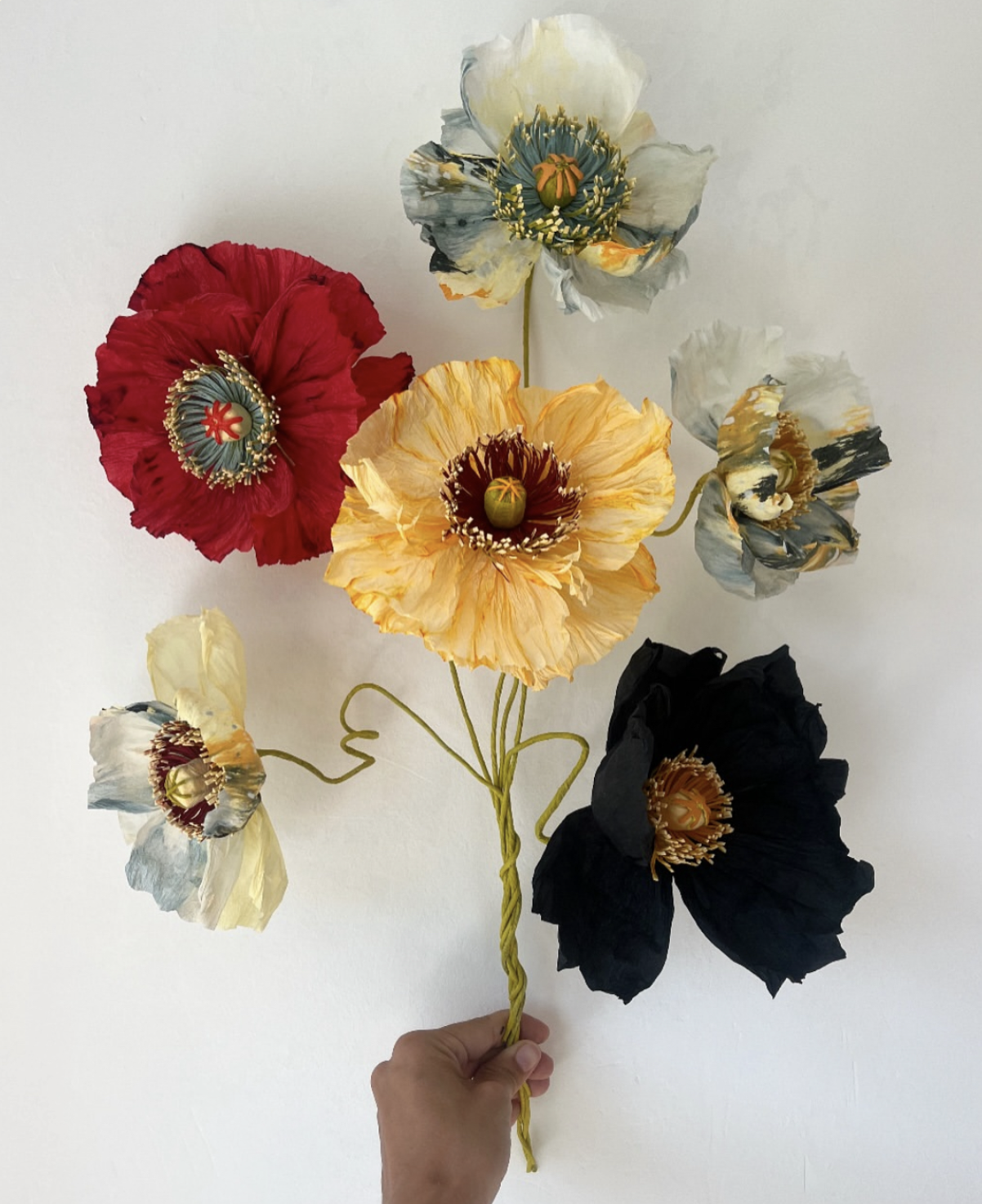
If there's a signature Emmeli Kimhi poppy at this point, it's the bold ones. A strong centre, hand-painted, sharp against petals that don't match it at all. Gold centres with tangy, almost acidic green. Gold petals with turquoise at the middle. Deep red against mustard yellow. Some of the paper is dyed with ink first, patterns you'd expect on an abstract painting rather than a flower.
These don't try to look like anything real, and I've stopped wanting them to. Each one stands as its own small sculpture, which is probably the most honest way to describe where this whole thread has led, from a bow-shaped stigma that hurt my fingers to this.
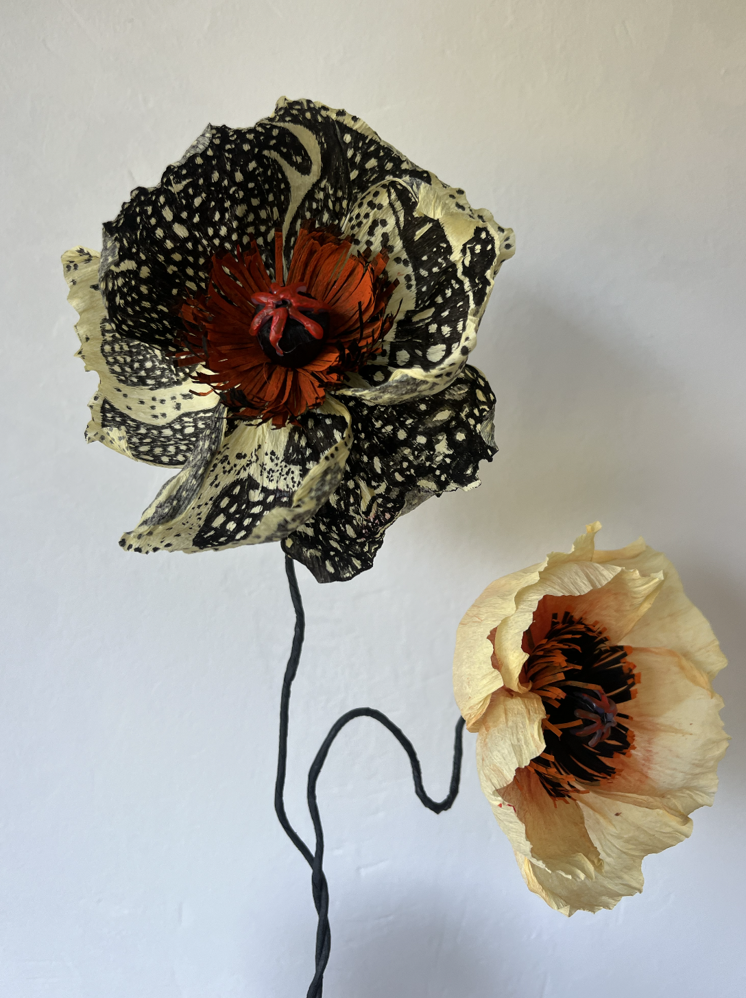
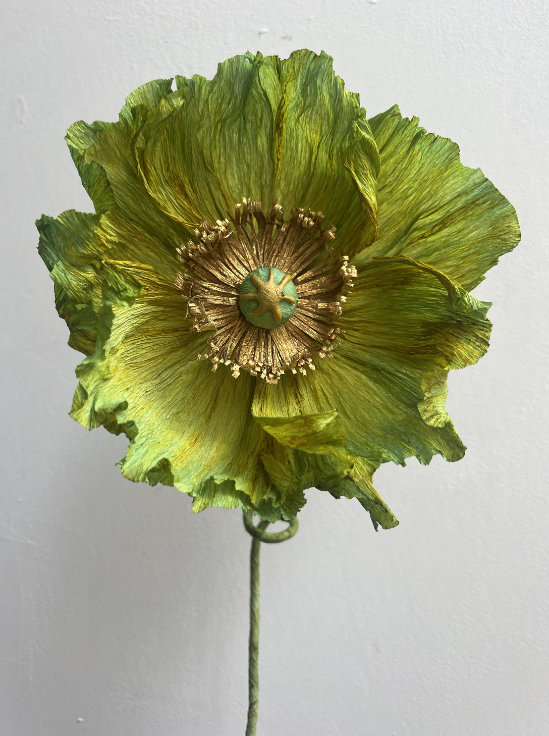
If you want the full story behind the Alcova Milan poppies for Studio Ashby, that's over here. And if any of this has put you in the mood for one of your own, click to shop.
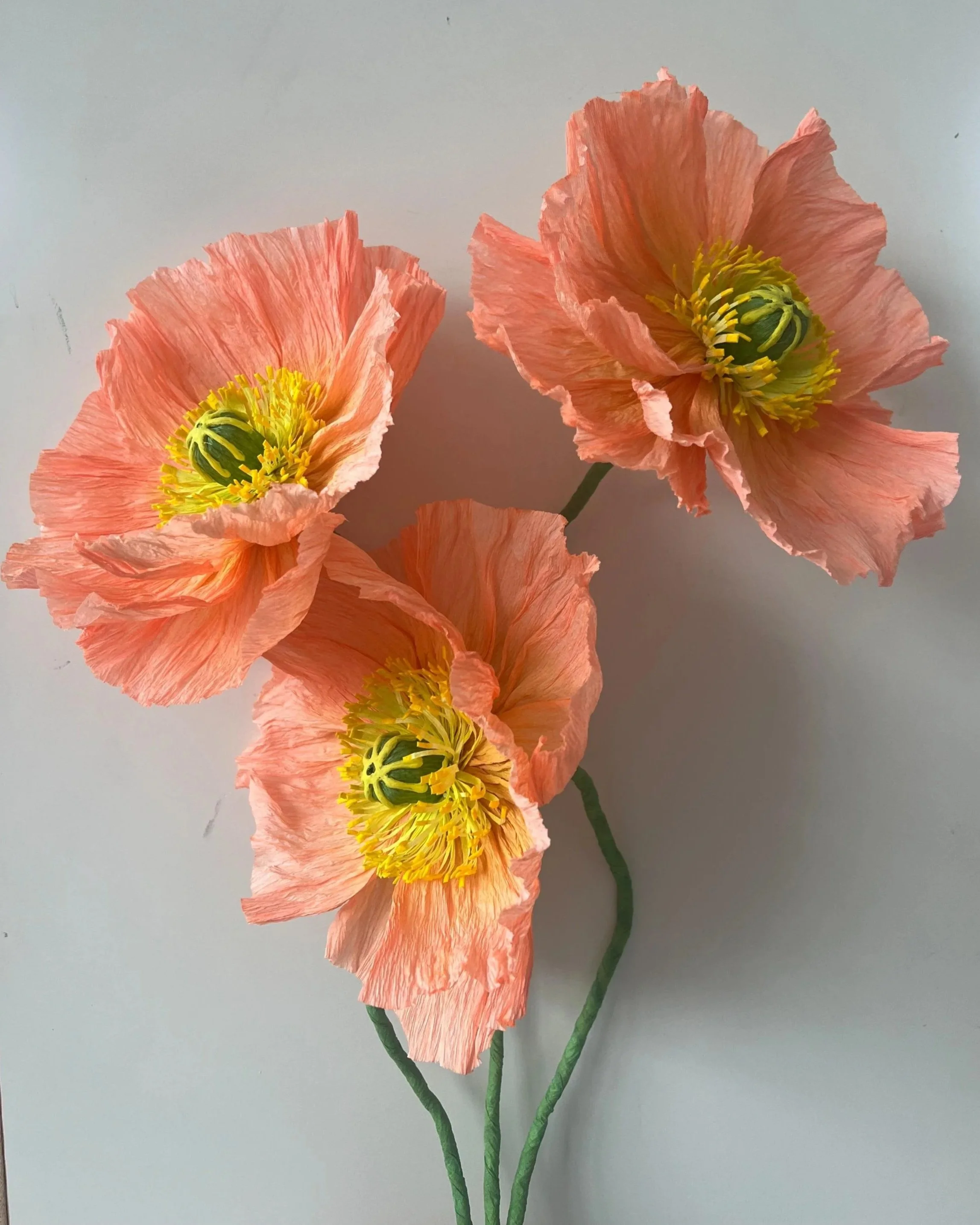
A single oversized poppy in soft peach, with ruffled petals and a hand-painted yellow centre. Bigger and more sculptural than a standard poppy — it holds its own on its own, or sits beautifully as the focal point in a larger group.
Made to order, so your poppy will have its own slight variations in petal shape and shading. That's not a flaw — it's just how handmade works.
Flower head: approx. 12–15cm | Height: approx. 50cm
Lead time: 2–3 weeks